GREGORIO
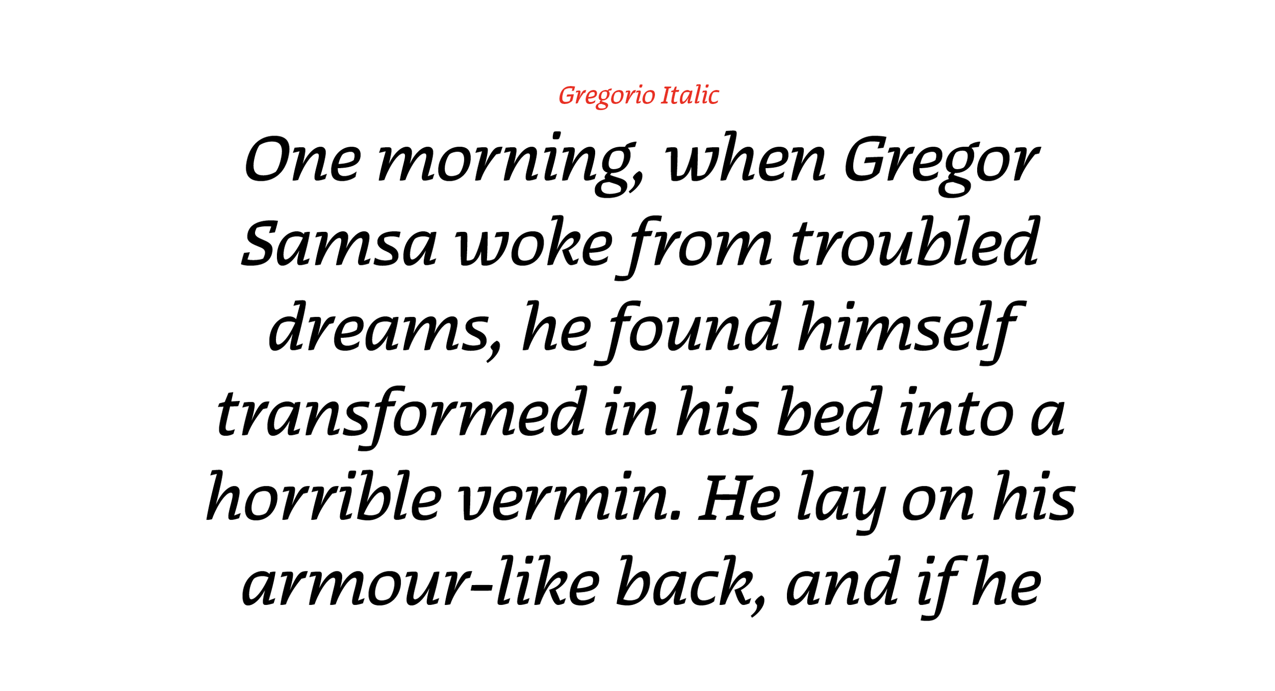
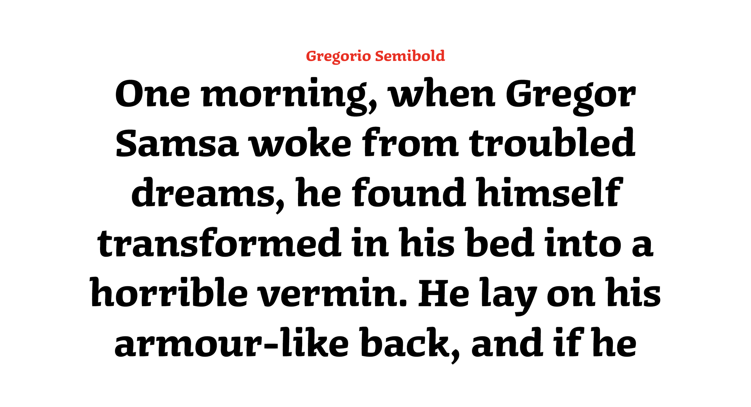
Gregorio is a semi-serif typeface based on broad nib calligraphy. It has a subtle swelling and forward tilt. Designed as a text face for short stories and novels, it has enough character to also perform as a display face on headlines and film titles. The idea was formed during Hannes Famira’s Exploring the Design Space workshop as part of the Type@Cooper Extended Program. It’s currently available in Regular, Semibold, Bold, and Italic. The name comes from Gregor Samsa, Kafka’s protagonist in The Metamorphosis. I like to think of Gregorio as his South American double, who has accepted the agony of his own existence, in a place where one is either a serif or a sans.


